
How to Choose Stamped Concrete Colors & Patterns for Your Patio

How to Choose Stamped Concrete Colors & Patterns for Your Patio
Quick Answer
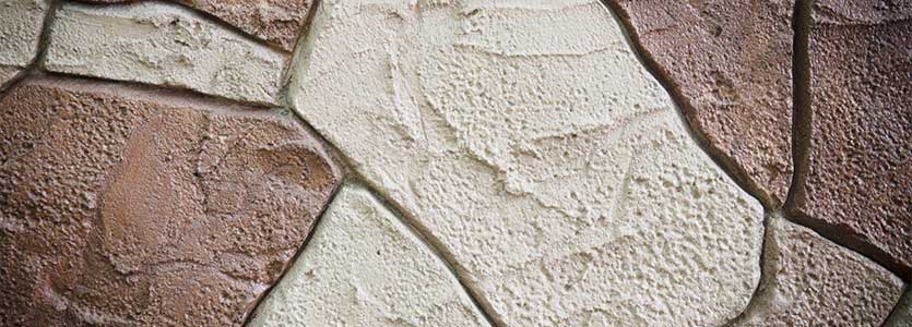
The best stamped concrete colors and patterns usually come from the house itself. Brick, stone, siding, roofing, trim, and landscaping already establish the visual character of the property, so the patio should relate to those materials instead of introducing an unrelated style. Before choosing a stamp or color, look at the entire setting and decide how much additional texture and contrast the space can handle.
Homeowners often get into trouble when they choose from a sample board without considering how that choice will look across several hundred square feet. A bold pattern may look impressive in a small sample and become overwhelming once it sits beside detailed brickwork or stone. A quieter pattern with restrained color can often make the patio feel more intentional because it supports the house instead of competing with it.
Let the House Set the Direction
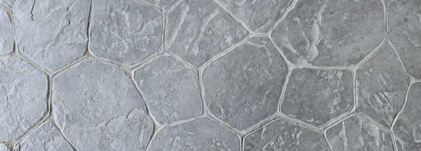
Stamped concrete offers enough choices to make it easy to overdesign a patio. If the home already has prominent brick, natural stone, contrasting trim, or other strong exterior details, adding another highly patterned surface can make the backyard feel visually crowded. A simpler slate texture, understated stone pattern, or seamless finish often works better because it adds depth without trying to become the dominant feature.
Homes with simpler exteriors give you more freedom to introduce stronger patterns or greater color contrast. That still doesn’t mean the patio should feel disconnected from the structure beside it. The most natural-looking combinations usually borrow something from the home, whether that’s a warm undertone from the brick, a cooler gray from the siding, or a muted earth tone that already appears in the landscaping.
Exact color matching usually isn’t necessary and can sometimes make the patio feel too coordinated. A warm brick home may work well with tan, brown, or muted stone colors without copying the brick itself, while a home with cooler stone or gray siding may support slate, charcoal, or softer gray tones. That relationship gives the patio enough distinction to stand on its own while still looking like it belongs on the property.
Give the Base Color Most of the Work
The base color establishes the overall character of stamped concrete, while secondary colors add depth to the texture. Problems usually start when the accent color becomes too aggressive and competes with the base instead of supporting it. Across a large patio, excessive contrast repeats hundreds of times and can make every joint and impression look exaggerated.
A more natural effect usually comes from allowing the base color to dominate and using the secondary tone to settle into lower areas of the texture. That creates the shadowing and variation that help stamped concrete resemble stone without making the surface look artificially busy. Deeper patterns can handle more contrast because the texture itself creates stronger relief, while shallow slate or seamless textures often look better with subtler color variation.
This is also why completed project photos are more useful than isolated color chips. A small sample can show the hue, but it can’t show how the base color and accent interact across a full patio in direct sun, shade, and changing light. Looking at finished installations gives you a much better sense of whether the color combination feels natural or overly dramatic.
Match the Pattern to the Size of the Patio
Pattern scale changes the way a finished patio reads from a distance. Smaller, highly detailed patterns may look attractive on a board and become repetitive across a broad outdoor area, especially when the home already has strong brick or stone textures. Larger slate patterns, random stone layouts, or seamless textures often give a bigger patio more visual breathing room.
Smaller patios can tolerate more detail because the pattern doesn’t repeat across as much surface area. Even then, the surrounding architecture should influence the decision because a compact patio beside busy masonry can still feel overloaded if the stamp introduces another dense pattern. Choosing the pattern after the patio dimensions are established gives you a much better sense of how much repetition the space can carry.
The shape of the patio can also influence what works. A pattern with strong straight lines may emphasize a rectangular patio, while random stone or seamless textures can soften an irregular layout. Those differences become much clearer when you think about the pattern across the full surface instead of treating the stamp as an isolated decorative choice.
Think About Furniture Before Choosing Heavy Texture
Patios have to work under tables, chairs, grills, and outdoor furniture, so texture affects more than appearance. Deep cobblestone or aggressively stamped stone patterns can create uneven contact points under chair and table legs, and pronounced grooves can collect more dirt and debris. Those characteristics may be perfectly acceptable on a decorative walkway but become frustrating on a patio used regularly for dining.
A shallower slate texture or seamless skin can still give the concrete plenty of character while making the surface easier to furnish and maintain. This becomes especially useful when the patio will see frequent gatherings and furniture will move around often. The surface should support the way the area will be used rather than asking the homeowner to work around the decorative treatment.
We’d weigh this heavily when helping someone choose a pattern. A dramatic texture can look excellent in photographs and still be less practical for the way a family intends to use the space. The best decorative decision should hold up after the furniture arrives and the patio becomes part of everyday life.
Seamless Texture Gives You Another Option
Stamped concrete doesn’t have to imitate individual stones or pavers. Seamless texture skins create the surface character of materials such as slate or sandstone without putting pronounced grout lines across the entire patio. The result can feel more restrained while still offering far more visual depth than plain finished concrete.
This approach works especially well when the home already has detailed brick, stone veneer, or several exterior materials competing for attention. Instead of introducing another obvious pattern, the patio can provide texture that supports the surrounding architecture. That often creates a more cohesive result because the concrete contributes character without trying to imitate another masonry system too literally.
Seamless texture can also work well for homeowners who like the natural appearance of stamped concrete but don’t want the patio to look like individual stone units. It gives them the benefit of decorative texture while keeping the surface visually continuous. That distinction is worth considering before assuming stamped concrete automatically means a bold repeating pattern.
Use Borders Only When They Improve the Design
A border can define the edge of a patio, introduce a secondary color, or help separate different areas within a larger outdoor space. It works best when it has a clear visual purpose rather than being added simply because decorative borders are available. If the main field already uses a detailed pattern and strong color variation, another contrasting element around the perimeter can make the patio feel overworked.
On a simpler surface, a darker or differently textured border can frame the patio cleanly and give the overall design more definition. It can also help connect the patio with another nearby material, such as brick on the house or darker accents elsewhere in the landscape. The value comes from how the border relates to everything around it, not from the fact that it adds another decorative feature.
This is one of the easiest places to exercise restraint. Decorative concrete gives homeowners plenty of opportunities to add detail, but using every available option rarely produces the strongest result. A border should stay because it improves the composition, not because it adds another upgrade to the project.
Look at Finished Projects Before Choosing a Color
Natural light changes stamped concrete throughout the day. A color that appears warm in direct afternoon sun may look considerably cooler in shade, while texture creates shadows that make secondary tones more noticeable. Sealers can also deepen the finished appearance, so the color you see on a small untreated sample may not represent how the completed patio will look.
Completed projects give you a much better reference because they show the pattern, color variation, and scale working together. Look for examples beside homes with similar exterior materials and patios close to the size you’re planning. That comparison helps you see whether a combination feels balanced across a real outdoor space instead of relying on a tiny sample.
Photos also make it easier to identify what you don’t like. You may discover that a pattern you admired on a board feels too busy when repeated across a large patio, or that a color you thought was too subtle looks far better once it covers the full surface. That kind of judgment becomes much easier when you evaluate completed work instead of isolated samples.
Allow Enough Variation to Keep the Surface Natural
Stamped concrete usually looks more convincing when the color has some variation rather than appearing perfectly uniform. Natural stone changes from one area to another, and texture catches light differently as the sun moves across the surface. Secondary coloring can reproduce some of that variation without making the patio look intentionally mottled.
The amount of variation still needs discipline. If every section looks dramatically different, the surface can feel inconsistent rather than natural. The strongest installations usually let the eye read the patio as one complete surface first, with tonal differences becoming noticeable only when you look more closely.
This is another reason the base color should carry most of the design. Secondary tones should help the texture read more naturally instead of becoming separate visual events across the patio. That approach gives stamped concrete depth without making the decorative treatment look forced.
What We’d Consider Before Recommending a Combination
Before recommending a stamped pattern or color, we’d want to see the house and the area where the patio will sit. The exterior materials tell us how much visual detail the space can handle, while the patio dimensions help determine whether a pattern will feel balanced or repetitive. We’d also want to know how the homeowner plans to use the area because heavy texture makes more sense in some settings than others.
Existing hardscape also affects the decision. If the property already has a prominent driveway, retaining wall, walkway, or stone feature, the new patio should relate to those materials rather than introducing another unrelated visual direction. Looking at the property as a whole usually narrows dozens of possible combinations into a much smaller group that actually fits.
That contractor input becomes more useful than simply handing someone a pattern catalog. Homeowners still make the final aesthetic choice, but they should be choosing among options that make sense for the house, the patio size, and the way the space will be used. That produces a better result than starting with every available color and trying to assemble a design from scratch.
Frequently Asked Questions
What stamped concrete patterns work well for patios?
Slate, random stone, flagstone, brick, wood-plank textures, and seamless finishes are all common choices. The best pattern usually comes from the scale of the patio, the exterior materials on the home, and how much texture the surrounding space can handle. A broad patio beside detailed brickwork may benefit from a quieter texture, while a simpler home can often support a stronger decorative pattern.
Should stamped concrete match the house?
Stamped concrete should relate to the house without copying it exactly. Pulling from an existing color family usually creates a more natural connection than trying to duplicate brick, siding, stone, or trim. The patio can have its own identity while still sharing enough visual cues with the home to feel intentional.
Should the accent color be darker than the base?
Accent colors are often darker because they settle into textured areas and help create depth. The amount of contrast should reflect the strength of the pattern, since deep stone textures can handle more variation than shallow slate or seamless finishes. A strong accent on a lightly textured surface can easily become more noticeable than intended.
Can stamped concrete use more than one color?
Yes, and multiple tones can help stamped concrete resemble natural stone more convincingly. The base color should still establish the overall appearance, while secondary tones provide variation and definition. Using too many competing colors can make the patio feel busy, so a restrained palette usually produces a more cohesive result.
Which stamped concrete patterns are easiest to clean?
Shallower textures and seamless finishes generally have fewer deep grooves where dirt and debris can collect. Heavily textured cobblestone or stone patterns may require more effort to keep clean, especially around dining areas where food, leaves, and outdoor debris collect. Cleaning requirements should be considered alongside appearance when choosing a pattern for a patio that will see regular use.
Choose the Pattern in the Context of the Property
TriStar Concrete Solutions installs stamped and colored concrete patios throughout Chattanooga, Cleveland, and surrounding communities. We can look at the exterior materials, patio layout, and how you plan to use the space before narrowing the choices to combinations that fit the property naturally. Call (423) 322-0670 or contact TriStar Concrete Solutions through our website to request an estimate.
RECENT POSTS
Discover more helpful articles about concrete driveways, patios, walkways, and other residential concrete projects.
NEED HELP?
Don’t hesitate to contact us for more information about concrete services.
Talk With Our Team
If you need a decorative section of stamped concrete put in, whether for your porch, patio, or a beautiful walkway, TriStar Concrete Solutions is ready to help. Contact us today to request a free estimate for stamped concrete construction in Cleveland, TN, Chattanooga, TN, or a nearby community.